Responsive WordPress Templates: Optimizing Your Site for Mobile Success
Estimated reading time: 9 minutes
Key Takeaways
- Mobile devices dominate internet traffic (over 60%), making responsive design essential.
- Non-responsive sites deter visitors (73% leave immediately) and harm SEO.
- Responsive WordPress templates automatically adapt layouts for all screen sizes.
- Mobile-first themes prioritize speed and user experience on smaller screens.
- Key features include fluid grids, flexible images, speed optimization, and touch-friendly navigation.
- Optimization involves using speed plugins, compressing images, simplifying navigation, and continuous testing.
- Solving device compatibility challenges requires flexible themes and thorough testing across platforms.
Table of Contents
- Responsive WordPress Templates: Optimizing Your Site for Mobile Success
- Key Takeaways
- Introduction: The Mobile Tsunami
- Why Responsive Design Matters for Your WordPress Site
- Mobile-First WordPress Themes: Built for Dominance
- Key Features of High-Quality Responsive WordPress Templates
- Mobile Optimization Tips for WordPress Users
- Solving Device Compatibility Challenges in Web Design
- Case Study: How a Travel Blog Won Mobile Users
- FAQ: Responsive WordPress Templates
- Final Tip
Introduction: The Mobile Tsunami
The digital landscape has shifted dramatically. Gone are the days when desktop browsing reigned supreme. Today, the internet lives in our pockets. Consider these staggering statistics: over 60% of global internet traffic now originates from mobile devices, and a whopping 92.3% of users access the web via smartphones. That’s billions of people scrolling, tapping, and shopping on the go.

What does this mean for your WordPress website? It’s simple: *if your site isn’t optimized for these mobile users, you’re not just missing out – you’re actively driving potential customers away*. The data is stark: 73% of visitors will abandon a non-responsive website immediately. They won’t pinch, zoom, or struggle to navigate. They’ll simply leave, likely heading straight to a competitor whose site *does* offer a seamless mobile experience.
Ignoring the mobile majority isn’t just bad practice; it’s a direct threat to your traffic, conversions, and ultimately, your revenue. The solution? Embrace the power of Responsive WordPress templates. These are specially designed themes that automatically adjust layouts, images, and content elements to provide an optimal viewing experience on *any* device, from the smallest smartphone to the largest desktop monitor. This guide will equip you with the knowledge and actionable strategies needed to leverage responsive templates and conquer the mobile web.
Why Responsive Design Matters for Your WordPress Site
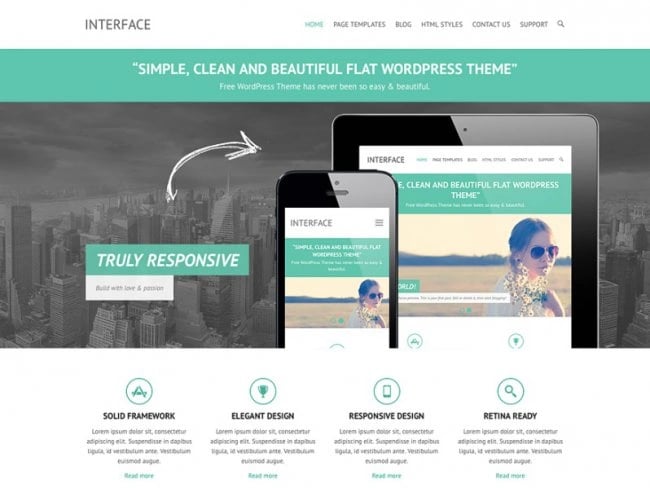
Responsive design isn’t just a fancy web development term; it’s a fundamental necessity for online success. It’s the practice of building a website that fluidly adapts its layout to fit the screen size it’s being viewed on. By dynamically resizing, hiding, shrinking, or enlarging elements, a responsive site ensures it looks great and functions flawlessly, whether accessed on a tiny smartphone, a mid-sized tablet, or a widescreen desktop monitor.
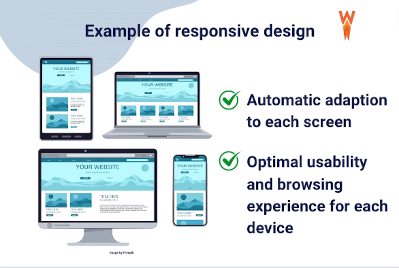
But *why* should you, as a WordPress site owner, prioritize responsive design? The benefits are compelling and far-reaching:
- Boost SEO Rankings: Google explicitly favors mobile-friendly websites. Since 2019, mobile-first indexing has become the standard, meaning Google primarily uses the mobile version of your site for indexing and ranking. A responsive WordPress template signals to Google that your site offers a positive mobile experience, which can significantly help you climb search engine results pages (SERPs). This directly impacts your site’s visibility and organic traffic potential. Furthermore, factors related to mobile usability, like page speed and Core Web Vitals, are key components of technical SEO performance.
- Keep Visitors Engaged: First impressions count, especially on mobile. If users arrive on your site and are met with text that’s too small to read, images that break the layout, or buttons that are impossible to tap accurately, they’ll leave – fast. Responsive sites significantly reduce bounce rates (reportedly by up to 35%) and increase average session durations. When users can easily navigate and consume your content without frustrating pinching or horizontal scrolling, they are far more likely to stay longer, explore more pages, and ultimately convert.
- Save Time and Money: In the past, businesses often had to build and maintain separate websites: one for desktop users and another (‘m-dot’ site) specifically for mobile. This doubled the effort for content updates, design changes, and SEO management. Responsive design eliminates this costly redundancy. One responsive theme works across all devices, streamlining development, significantly cutting maintenance time, and reducing overall costs. You manage one set of content, one design framework, and one SEO strategy.

Real-World Impact Example:
A local neighborhood bakery, struggling with an outdated, non-responsive website, saw minimal online orders despite excellent products. After investing in a switch to a modern, responsive WordPress theme, the results were almost immediate. Within just *two months*, they reported a 40% spike in mobile traffic accessing their menu and online ordering system, coupled with a 25% increase in completed online orders originating from smartphones. Customers praised the easy navigation and clear visuals on their phones, directly translating to increased revenue.
Mobile-First WordPress Themes: Built for Dominance
While traditional responsive design often starts with a desktop layout and adapts it *down* for smaller screens, the mobile-first approach flips this philosophy. Mobile-first WordPress themes are designed with the smallest screens – smartphones – as the primary focus from the outset. The layout, features, and performance are optimized for mobile constraints first, and *then* the design is progressively enhanced for tablets and desktops.
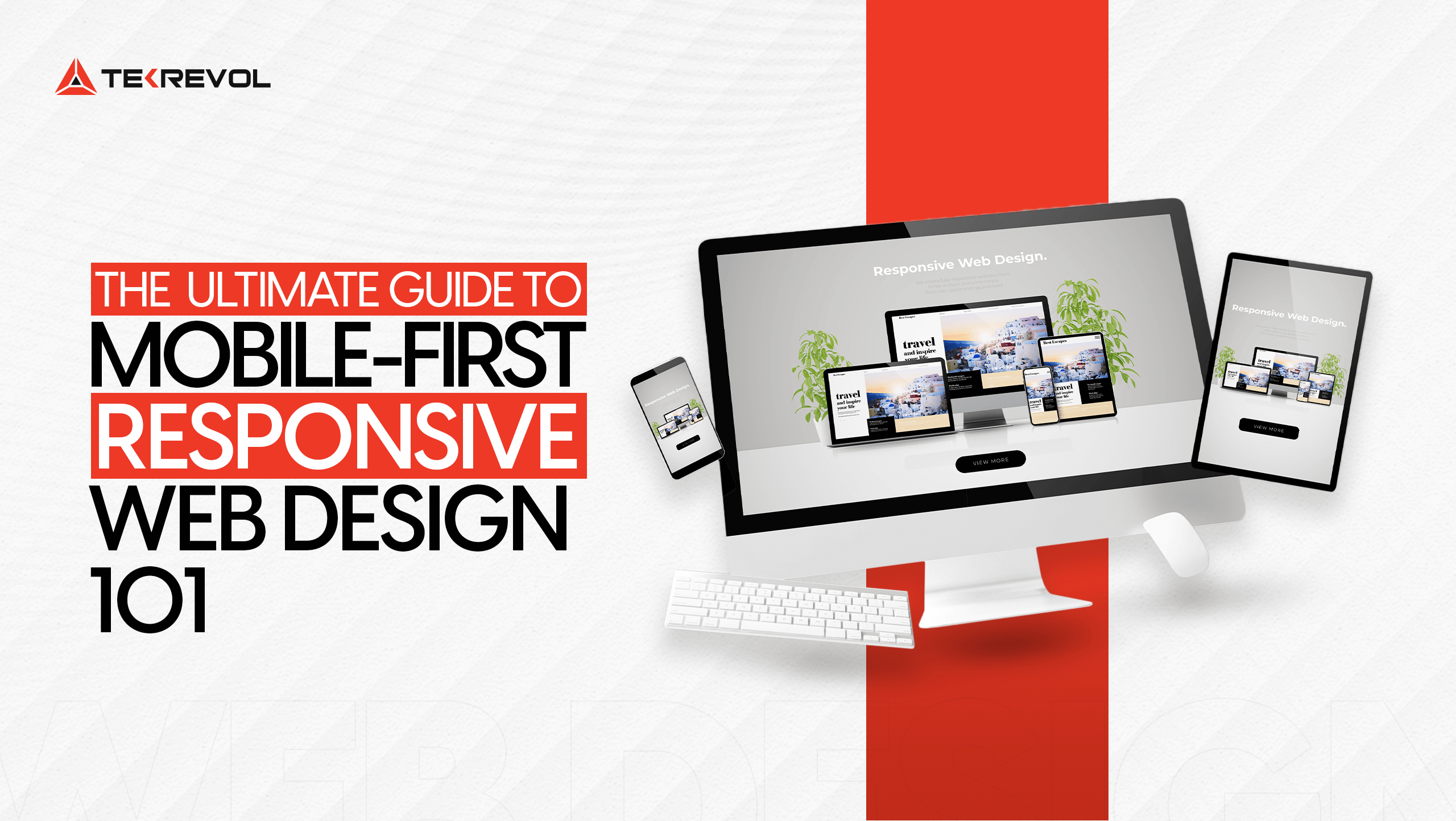
Why this shift? Because designing mobile-first forces developers to prioritize what’s truly essential. It leads to cleaner code, faster loading times (critical for mobile users often on slower connections), and interfaces inherently suited for touch navigation. Unlike traditional responsive themes that might carry desktop-centric ‘baggage’ resulting in slower mobile performance, mobile-first themes are lean and optimized for the majority user base from the ground up. For businesses seeking highly tailored online experiences, exploring custom WordPress design services can unlock the full potential of mobile-first strategies.
Top Mobile-First Themes in 2024
Several WordPress themes excel with a mobile-first philosophy. Here are a few standouts:
- Divi: Renowned for its powerful visual drag-and-drop builder, Divi allows for deep customization without needing to write code. It offers granular control over how elements appear on different devices (mobile, tablet, desktop) directly within its real-time editor. This makes it exceptionally flexible for crafting unique mobile experiences. While feature-rich, careful optimization is needed to maintain peak speed.

- Astra: Astra is famous for its incredible speed and lightweight footprint (often under 50KB on the frontend). It’s built with performance and SEO as top priorities. Astra offers excellent mobile responsiveness out-of-the-box and integrates seamlessly with page builders like Elementor and Beaver Builder. Its minimalist approach makes it perfect for blogs, business sites, and online stores where speed is paramount.

- Neve: Another theme built explicitly for speed, Neve often achieves load times under 1.3 seconds. It emphasizes a mobile-first approach and offers strong compatibility with Google AMP (Accelerated Mobile Pages) for near-instant loading on mobile search. Neve is also highly compatible with WooCommerce, making it a great choice for e-commerce sites targeting mobile shoppers.
- GeneratePress: Similar to Astra, GeneratePress is known for its commitment to speed, stability, and accessibility. It’s incredibly lightweight and modular, allowing you to enable only the features you need. It provides excellent responsive controls and is favored by developers and performance-conscious site owners.
Mobile-First vs. Traditional Responsive Themes
- Mobile-first Themes:
- Pros: Generally faster loading speeds on mobile, inherently better touch control design, focuses on essential content first, often cleaner code.
- Cons: Desktop design might sometimes feel like an afterthought if not carefully planned, may require more thought for complex desktop layouts.
- Traditional Responsive Themes (Desktop-First):
- Pros: Often allows for more complex and feature-rich desktop designs initially, development workflow might be more familiar to some designers.
- Cons: Can lead to slower mobile performance due to loading desktop assets, mobile experience might be a scaled-down version rather than truly optimized, potential for layout issues on smaller screens if not carefully adapted.
For most modern websites targeting broad audiences, adopting a *mobile-first mindset*, even when using a traditionally responsive theme, is the recommended approach.
Key Features of High-Quality Responsive WordPress Templates
Simply declaring a theme “responsive” isn’t enough. Truly effective responsive WordPress templates incorporate specific technical features designed to ensure a seamless experience across the entire device spectrum. When selecting or evaluating a theme, look for these critical features:
- Fluid Grids & Flexible Images: This is the cornerstone of responsiveness.
- Fluid Grids: Instead of fixed-pixel widths (e.g., 960px wide), layouts are built using relative units like percentages or viewport widths (vw). This allows columns and containers to automatically resize proportionally based on the screen width.
- Flexible Images: Images are set to scale within their containing elements, typically using CSS rules like `max-width: 100%; height: auto;`. This prevents large images from breaking the layout or requiring horizontal scrolling on smaller screens. Look for themes that also support responsive image techniques (like `srcset`) to serve appropriately sized images based on device resolution, saving bandwidth.
- Comprehensive Device Compatibility: A good theme is rigorously tested to ensure seamless performance across a wide array of devices and operating systems. This includes:
- Major Mobile OS: iOS (Safari) and Android (Chrome).
- Various Screen Sizes: From small smartphones to large phablets, tablets (portrait and landscape), and even newer foldable devices.
- Different Browsers: Consistent rendering across Chrome, Firefox, Safari, Edge, etc., on both mobile and desktop.
- Speed Optimization Built-In: Mobile users are impatient; slow loading times kill engagement. High-quality themes are coded efficiently and often include performance-enhancing features:
- Clean, Minimal Code: Avoiding bloated code and unnecessary scripts.
- Optimized Resource Loading: Techniques like lazy loading for images/videos (loading them only when they enter the viewport) and asynchronous loading for scripts (preventing render-blocking).
- Themes like Astra boast loading times under 0.5 seconds, directly impacting user satisfaction and reducing abandonment rates – a crucial factor in technical SEO.
- Touch-Friendly Menus and Navigation: Interacting with a website via touch is fundamentally different from using a mouse. Good responsive themes account for this:
- Mobile Menus: Implementing clear, easily accessible mobile navigation patterns like hamburger menus (the three horizontal lines icon) or off-canvas menus that slide in.
- Large Tap Targets: Ensuring buttons, links, and menu items are sufficiently large and well-spaced to be tapped accurately with a finger (Google recommends a minimum size of 48×48 CSS pixels).
- Swipe-Friendly Elements: Utilizing sliders or carousels that respond intuitively to swipe gestures.
- Customizable Breakpoints: Breakpoints are the specific screen widths at which the website’s layout changes (e.g., switching from a 3-column to a 1-column layout). While themes have default breakpoints, advanced themes (like Divi or those used with page builders) allow you to customize these points or add new ones, giving you finer control over how your content adapts across different device sizes.
Mobile Optimization Tips for WordPress Users
Choosing a great responsive theme is a massive step forward, but it’s often just the beginning. To truly dominate the mobile experience, even the best responsive WordPress templates benefit from further fine-tuning and ongoing optimization. Implement these crucial mobile optimization tips:
- Install Speed & Mobile Enhancement Plugins:
- Caching Plugins: Tools like W3 Total Cache or WP Super Cache store static versions of your pages, drastically reducing server load and speeding up delivery to visitors. Configure browser caching and leverage Content Delivery Networks (CDNs) for global speed improvements.
- Mobile-Specific Plugins: While less common now with good responsive themes, plugins like WP Touch were popular for adding a separate mobile-friendly theme layer. However, focusing on optimizing your *main* responsive theme is generally preferred today.
- AMP (Accelerated Mobile Pages): The official AMP plugin (or alternatives) creates stripped-down, ultra-fast versions of your pages specifically for mobile users arriving from Google search or other platforms. This can provide near-instant loading but often involves a simplified design and functionality trade-off. Evaluate if AMP is right for your specific content and audience.
- Compress and Optimize Images: Large image files are one of the biggest culprits of slow mobile loading times.
- Use Compression Plugins: Install plugins like ShortPixel, Smush, or EWWW Image Optimizer. These tools automatically compress images upon upload (often shrinking file sizes by 70% or more) with minimal or no perceptible loss in visual quality.
- Choose Modern Formats: Serve images in next-gen formats like WebP, which offers superior compression compared to traditional JPEG or PNG. Many optimization plugins can handle this conversion automatically.
- Resize Appropriately: Don’t upload massive 4000px-wide images if they’ll only be displayed at 800px wide. Resize images to appropriate dimensions *before* uploading.
- Simplify Navigation and Layout: What works on a large desktop screen can be cluttered and confusing on mobile.
- Streamline Menus: Replace complex, multi-level dropdown menus with clear hamburger icons or simplified top-level navigation for mobile views. Prioritize essential pages.
- Thumb-Friendly Design: Ensure buttons, links, and form fields are easy to tap accurately. Follow the minimum 48×48 pixel guideline and provide ample spacing between interactive elements to prevent accidental taps. Place key calls-to-action (CTAs) in easily reachable areas (often lower on the screen).
- Prioritize Content: Mobile users often scan quickly. Ensure your most important content and CTAs are visible “above the fold” (without excessive scrolling). Use clear headings, short paragraphs, and bullet points to improve readability on small screens. Avoid intrusive pop-ups that are hard to dismiss on mobile.
- Test Relentlessly and Iterate: Don’t assume your site works perfectly on mobile just because you installed a responsive theme.
- Use Testing Tools: Regularly run your site through Google’s Mobile-Friendly Test and PageSpeed Insights to identify specific issues related to usability and performance on mobile devices.
- Browser Developer Tools: Use the device emulation modes in Chrome, Firefox, or Safari developer tools to quickly preview how your site looks on various screen sizes.
- Cross-Browser/Device Testing Platforms: Services like BrowserStack or LambdaTest allow you to test on thousands of real devices and browsers.
- Real Device Testing: Most importantly, test your site on *actual* physical smartphones and tablets (both iOS and Android). Emulators don’t always capture real-world performance quirks or touch interactions accurately. Ask friends or colleagues with different devices to check your site.
Solving Device Compatibility Challenges in Web Design
Ensuring true device compatibility in web design is about more than just shrinking content. It means guaranteeing your website functions flawlessly and looks aesthetically pleasing across the ever-expanding universe of screen sizes, resolutions, operating systems, and browsers. While responsive themes handle much of the heavy lifting, specific challenges often arise:
- Screen Size and Resolution Variations: The sheer diversity is immense – from tiny smartwatch screens (less relevant for most websites) to standard smartphones, large phablets, foldable phones (with unique aspect ratios when open/closed), tablets in portrait and landscape, laptops, and massive 4K desktop monitors. A design must be truly fluid to adapt gracefully.
- Operating System and Browser Quirks: Different OS/browser combinations can render CSS, fonts, and JavaScript slightly differently. For instance:
- Safari on iOS might handle certain CSS properties (like `vh` units or complex animations) differently than Chrome on Android.
- Older browser versions might not support modern CSS features, requiring fallbacks or graceful degradation.
- Font rendering can vary subtly, affecting layout spacing.
- Interaction Differences: Touch input (tap, swipe, pinch) requires different design considerations than mouse input (click, hover, scroll wheel). Hover effects, for example, don’t translate directly to touch devices. Navigation needs to be easily tappable, not rely on precise mouse-overs.
- Network Conditions: Mobile users are often on slower or less reliable cellular connections compared to desktop users on broadband. This reinforces the need for speed optimization, efficient code, and optimized media.
Solutions and Best Practices:
- Leverage CSS Media Queries: These are the core technique behind responsive design, allowing you to apply different CSS styles based on device characteristics like screen width, height, orientation, and resolution. Well-structured themes use these extensively.
- Choose Themes with Flexible Layouts and Controls: Opt for themes (like Divi, Astra with page builders) that offer fine-grained control over responsiveness, including adjustable breakpoints, visibility controls (hiding elements on specific devices), and different styling options per device.
- Test, Test, Test: As mentioned before, thorough testing is non-negotiable.
-
- Use browser developer tools for initial checks.
- Employ simulation platforms like BrowserStack or LambdaTest to cover thousands of device/browser combinations virtually. These services are invaluable for spotting inconsistencies you might miss otherwise.
- Conduct tests on real physical devices representing your target audience (e.g., popular iPhone and Android models).
-
- Adopt Progressive Enhancement: Start with a baseline functional experience for all browsers/devices and then *add* enhancements (more complex layouts, animations, features) for more capable browsers and larger screens. This contrasts with graceful degradation, which starts complex and removes features for less capable browsers.
- Keep Updated: Regularly update your WordPress core, theme, and plugins. Updates often include bug fixes and improvements related to compatibility with new devices, browser versions, and web standards.
Case Study: How a Travel Blog Won Mobile Users
“Wanderlust Chronicles,” a popular travel blog, had built a strong following primarily through desktop readers who enjoyed its long-form content and high-resolution photography. However, analytics revealed a troubling trend: despite increasing mobile traffic, the mobile bounce rate was hovering around an alarming 50%, and session durations were significantly shorter compared to desktop. Their existing theme, while technically “responsive,” rendered poorly on smartphones, with tiny text, overlapping elements, and slow-loading images.
Recognizing the urgent need for change, the blog owners decided on a site overhaul, specifically focusing on mobile performance and usability. They opted to redesign their site using the Divi theme, attracted by its visual builder and granular mobile customization options.
The redesign process involved:
- Implementing a Mobile-First Layout: Using Divi’s controls, they designed simpler, single-column layouts specifically for mobile screens, ensuring readability and easy scrolling.
- Optimizing Images: They used an image compression plugin (ShortPixel) and Divi’s built-in responsive image handling to serve appropriately sized images for mobile devices, drastically cutting load times.
- Streamlining Navigation: The complex multi-level desktop menu was replaced with a clean, icon-triggered slide-in menu on mobile.
- Improving Text Readability: Font sizes and line spacing were adjusted specifically for mobile viewing within the Divi builder.
- Enhancing CTAs: Affiliate links and subscription buttons were made larger and placed strategically for easy tapping on touchscreens.
The results after launching the redesigned site were dramatic:
- Within 3 months, overall mobile traffic surged by 55%.
- The mobile bounce rate dropped from 50% to below 25%.
- Average mobile session durations grew by over 30%, indicating significantly better engagement.
- Crucially, conversions (affiliate link clicks and newsletter sign-ups) from mobile users increased by nearly 40%.
- As a direct result of the improved mobile experience and engagement signals, their SEO rankings for key terms like “best travel tips for SE Asia” jumped from page 2 (#12) into the top 3 positions.

This case study clearly illustrates how switching to a powerful, well-customized responsive theme like Divi, combined with a focus on mobile optimization best practices, can directly translate into significant gains in traffic, user engagement, conversions, and SEO performance.
FAQ: Responsive WordPress Templates
Q: Are free responsive WordPress templates reliable?
A: Some free themes, particularly ‘lite’ versions of reputable premium themes (like Astra, Neve, GeneratePress), are quite reliable and well-coded for responsiveness. However, free themes *can* sometimes lack advanced features, customization options, dedicated support, and regular updates compared to their premium counterparts. Always check reviews, active installations, and the last updated date before choosing a free theme. For business-critical sites, investing in a premium theme often provides better long-term value and peace of mind.
Q: How often should I update my responsive WordPress theme?
A: You should aim to apply theme updates as soon as they become available, which might be monthly or sometimes more frequently. Reputable theme developers release updates to fix bugs, patch security vulnerabilities, improve performance, and ensure compatibility with the latest version of WordPress, plugins, new browser versions, and emerging device types. Delaying updates can leave your site vulnerable and may lead to compatibility issues down the line. Always backup your site before applying updates.
Q: Can I make an old, non-responsive theme mobile-friendly?
A: Technically, yes, but it’s often complex and inefficient. You could potentially use plugins designed to create a separate mobile version (like WP Touch, though this is less ideal than true responsiveness) or hire a developer to manually add responsive CSS (media queries) via a child theme. However, this can be time-consuming, costly, and might not yield results as good as a theme built responsively from the ground up. In most cases, switching to a modern, inherently responsive or mobile-first theme is the more practical and effective long-term solution.
Q: What’s the difference between responsive and adaptive design?
A: Responsive design uses fluid grids and flexible images to continuously adjust to *any* screen size. The layout flows and reflows smoothly. Adaptive design, on the other hand, uses fixed layouts that ‘snap’ into place at specific screen widths (breakpoints). It essentially detects the device type/size and serves one of several pre-designed fixed layouts. Responsive design is generally more flexible and future-proof, while adaptive can sometimes be easier to implement for specific target device sizes but may not look perfect on screens between breakpoints. Most modern WordPress themes utilize responsive techniques.
Q: How does responsive design affect loading speed?
A: A well-implemented responsive design, especially one following mobile-first principles, *should* improve mobile loading speed compared to serving a heavy desktop site to mobile users. However, poorly optimized responsive sites can still be slow if they load large images, excessive scripts, or inefficient code regardless of the device. Techniques like responsive images (serving smaller image files to smaller screens), optimized code, and lazy loading are crucial for ensuring a responsive site is also a *fast* site on mobile.
Final Tip
Don’t guess – *know* how your site performs on mobile. Audit your site’s mobile performance today. Utilize tools like Google PageSpeed Insights (checking the Mobile tab specifically) and run Google’s Mobile-Friendly Test. Consider using behavior analytics tools like Hotjar heatmaps or Microsoft Clarity session recordings to visually understand where mobile visitors are struggling or dropping off. Identifying these friction points is the first step to fixing them. For a comprehensive, professional evaluation of your site’s mobile readiness and overall search visibility, consider investing in expert SEO audit services.
